


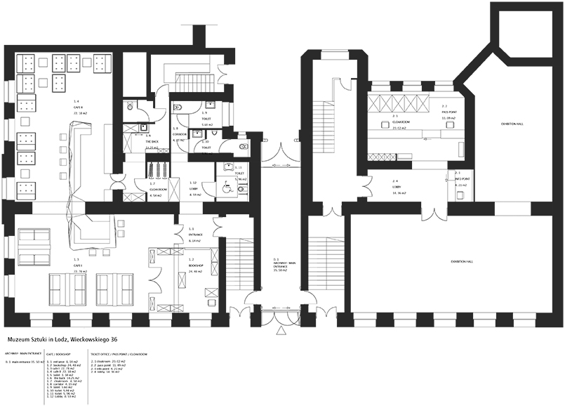
INFO O PROJEKCIE
Opis projektu przebudowy wnętrz gmachu głównego ms -
Muzeum Sztuki przy ul. Więckowskiego 36 w Łodzi
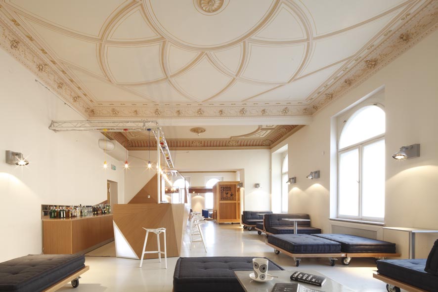
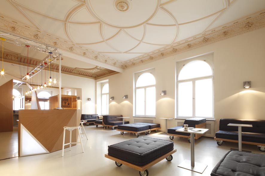
Muzeum Sztuki w Łodzi, ma awangardową tradycję. Pracuje ze sztuką XX i XXI wieku, a jednocześnie oddział ms mieści się w XIX-wiecznym mieszczańskim pałacu. Projekt modernizacji parteru budynku i przystosowania go do nowych funkcji musiał poszanować obie te tradycje: awangardy i zabytkowego budynku. Dotychczasowy podział funkcji pomieszczeń przy wejściu do Muzeum (portiernia, wąska klatka schodowa, szatnia) nie sprzyjał wrażeniu przystepności instytucji. Brakowało też przestrzeni wspólnej, w której mogłoby się rozgrywać życie społeczne. Celem zmian było stworzenie miejsca "z klimatem", zachęcającego widzów do pozostania w Muzeum po wystawie, podyskutowania i wymienienia się opiniami.
Tę wizualną politykę rozpoczęłyśmy już od elewacji od strony ul. Więckowskiego, w którą bez naruszania zabytkowej tkanki budynku, wkomponowane zostało przeszklone wejście. Dzięki temu zabiegowi, budynek wyróżnia się na tle otoczenia, sygnalizując jednocześnie, że w jego wnętrzu kryje się to, co „inne”, co przekracza potoczną percepcję rzeczywistości.
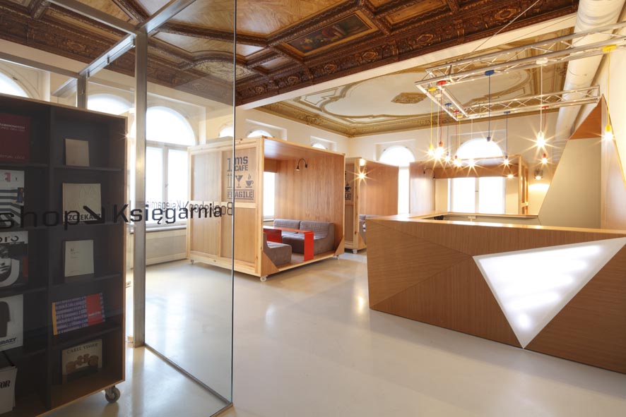
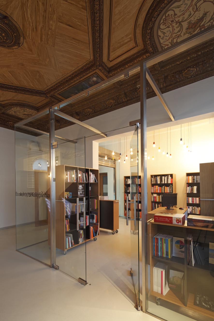
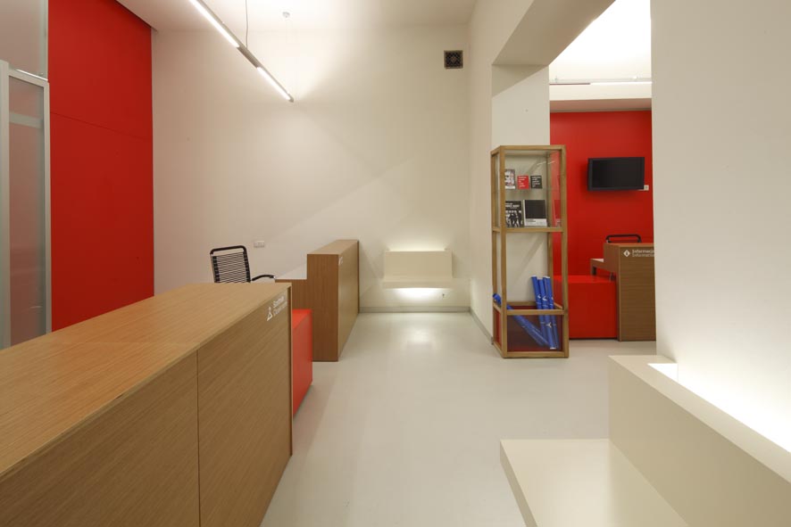
Po wejściu do przejazdu bramowego widz jest w sposób czytelny skierowany oznakowaniem na ekspozycję (na prawo) lub do klubu-kawiarni i księgarni (na lewo). Dodatkowo, funkcję identyfikacji wizualnej pełnią kolor i światło, użyte oszczędnie, punktowo. Czytelny podział przestrzeni ma ułatwiać widzowi intuicyjne rozumienie i korzystanie z jej funkcji. Na wprost wejścia na ekspozycję znajduje się punkt informacyjny i sprzedaży biletów zaprojektowany z mocnym akcentem czerwieni i stanowiący tym samym silny kontrapunkt kolorystyczny dla reszty wnętrza.
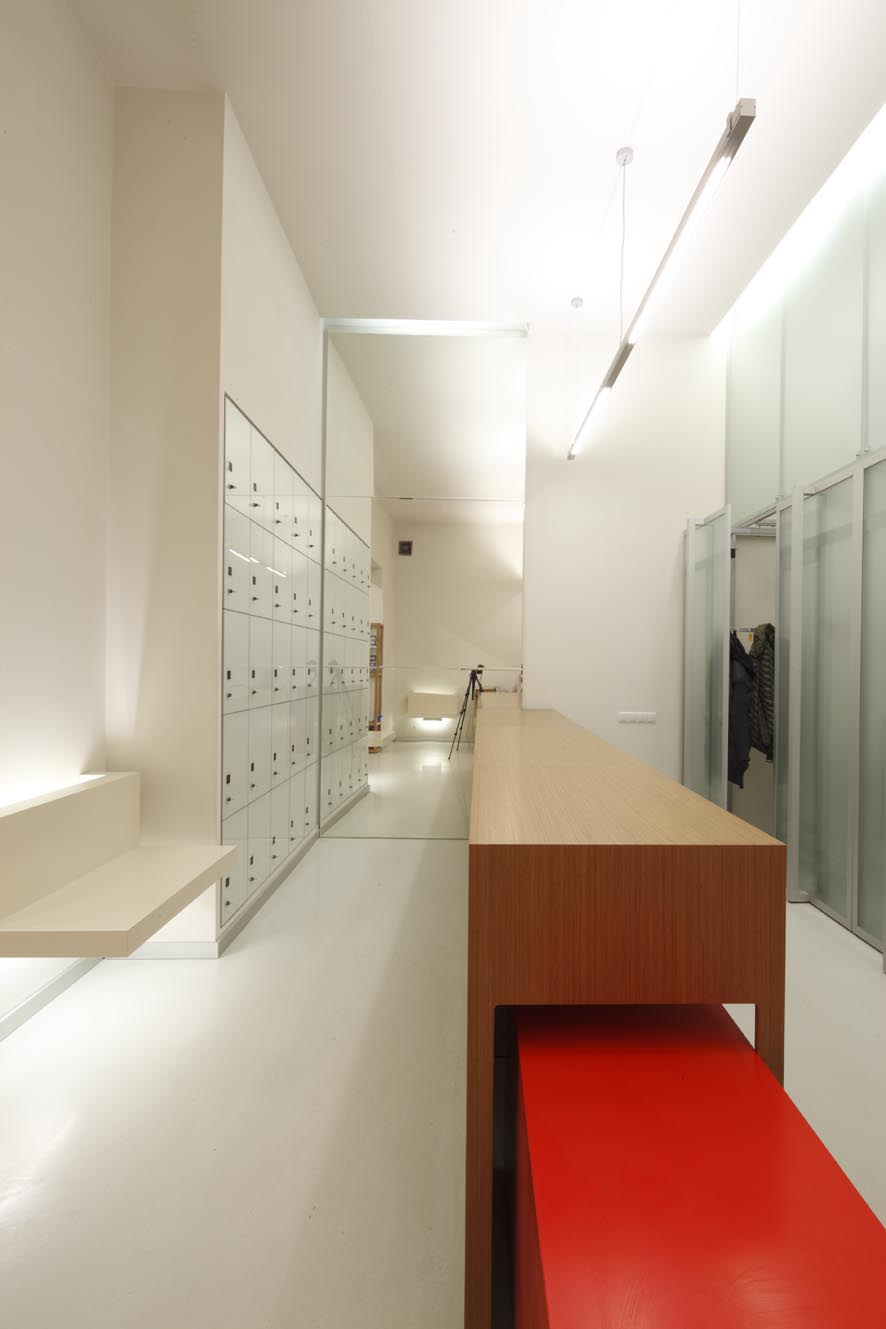
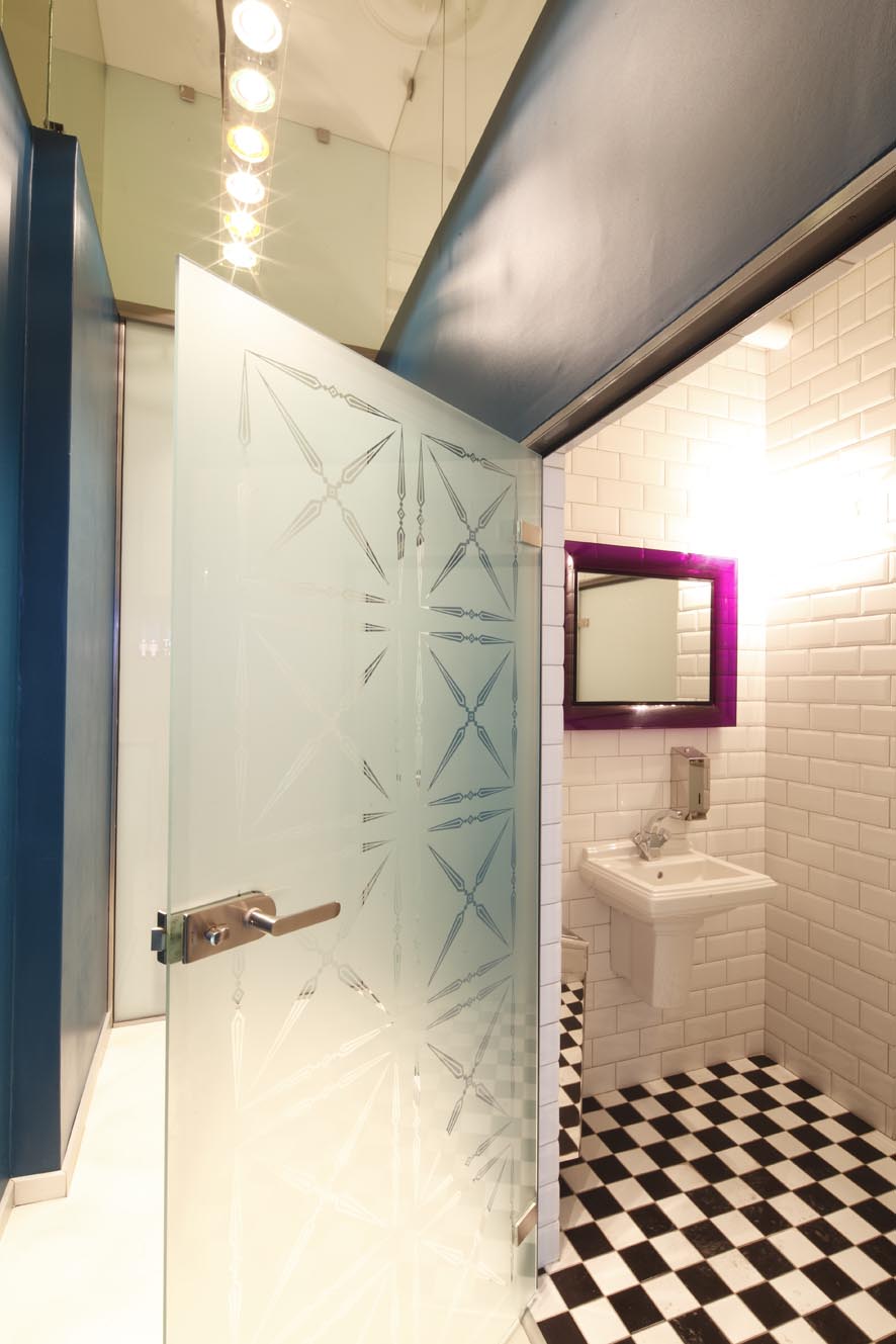
Szatnię i punkt wydawania przepustek łączy wspólna lada. Ubrania są przechowywane w wysuwanych szafach o szklanych frontach. To praktyczne rozwiązanie powala uniknąć chaosu ale także umożliwia dostęp dziennego światła . Obok szatni znajduje się całościenne lustro, które multiplikuje i powiększa optycznie niewielką przestrzeń.
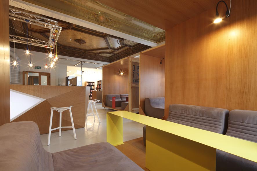
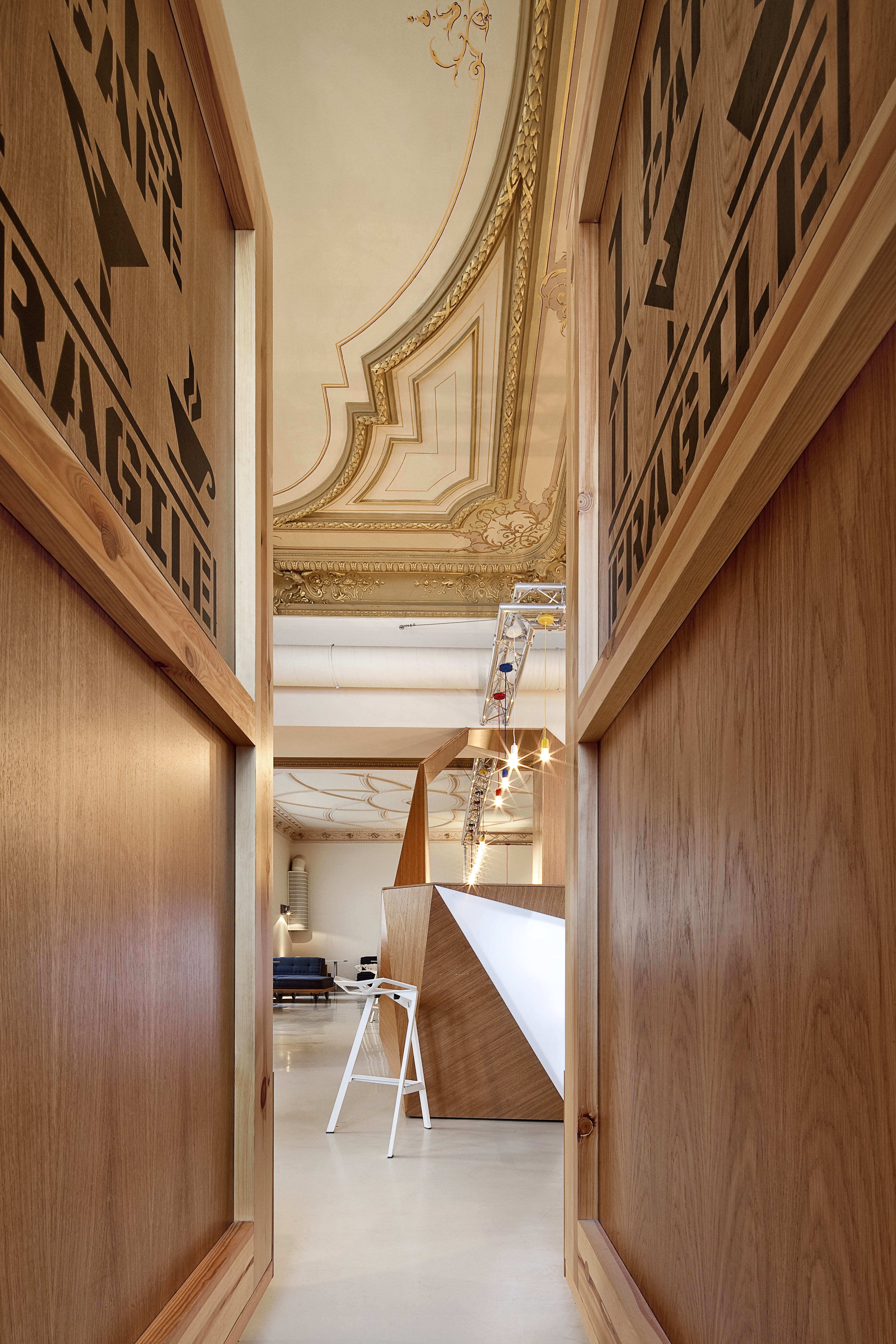
Największym wyzwaniem była część budynku gdzie umieściliśmy kawiarnię i księgarnię. Znajduje się tutaj: przeszklony box z otwartą na klub księgarnią, dwie sale klubu- kawiarni, zaplecze baru oraz szatnia i toalety. Kawiarnia działa niezależnie poza godzinami otwarcia wystaw. Stąd niezależne wejście do tej części budynku.
Użyłyśmy prostych materiałów, takich jak sklejka drewniana, metal i szkło, co było konsekwencją naszego pierwotnego założenia, tzn. znalezienia sposobu na wydobycie piękna zabytkowych, pałacowych wnętrz bez imitowania ich stylu. Posłużyłyśmy się kontrastem, zderzając wnętrza XIX- wiecznego budynku ze współczesnym dizajnem. Szukałyśmy też bezpośrednich nawiązań do muzeum. Stąd pomysł stworzenia wnętrza przypominającego zapomniany magazyn dzieł sztuki, a w nim mobilne meble, których odległym pierwowzorem formalnym są skrzynie do transportu dzieł sztuki, wózki, platformy, itp. oraz dziwna "krystaliczna" forma baru.
To był najtrudniejszy element całego projektu. Zarowno dla nas jak i dla stolarzy. Chciałyśmy zbudować formę która wygląda jak fragment jakiejś tajemniczej rzeźby - konstrukcji, która wyrasta wprost ze ścian i podłogi. Jednocześnie bar musiał być wygodny i atrakcyjny wizualnie. Udało nam się zbudować połamaną, krystaliczną formę baru, ze sklejki i podświetlonego peksi, zachowując jednoczesnie zasady ergonomi. No i świetnie pasuję do niego stołki barowe Konstantina Grcica...
Wszystkie wprowadzone do całości projektu elementy mają swoje odniesienia do zbiorów Muzeum. Są to jednak analogie odległe i ukryte – tworzące po prostu wizualny świat znaków spójny z uniwersum dzieł znajdujących się w muzealnej kolekcji.
Autor:
Magdalena Koziej
Paulina Stępień
Projekt:
2008
Realizacja :
2009
Zdjęcia:
Olo Rutkowski
INFO ABOUT PROJECT
Conversion design of the main building of the Museum of Art (ms) located at 36 Więckowskiego Street in Łódź
The Museum of Art in Łódź has an avant-garde tradition. It contains 19th and 20th century art, at the same time being contained in an 19th century middle-class palace. In order to modernize the ground floor of the building and adapt it for new functions, it was necessary to pay respect both to the avant-garde tradition, as well as the building’s historic function. The previous functional division of the rooms at the Museum’s entrance (porter’s room, narrow stairwell, cloakroom) failed to create an impression of accessibility. The Museum also lacked a common space as a venue for social life. The objective was to create a place with its own personality, encouraging people to stay in the museum after an exhibition, discuss their views and share their opinions.
This visual policy employed in our design becomes clear already at the building’s façade at Więckowskiego Street, into which a glassed-in entrance was incorporated without violating the building’s historic structure. This made the Museum stand out among the other buildings, simultaneously indicating that its interior may hide “the other”, something that transcends the common perception of reality.
After entering the gateway passage, the viewer is directed by means of clear signs towards the exhibition (right) or the cafeteria and bookshop (left). In addition, specific places are identified visually by means of sparingly used color and light. The clear division of space should make it easy for the viewer to understand it and use its functions intuitively. Opposite the exhibition entrance, there is an information and ticket desk, designed with a strong note of red, providing a powerful counterpoint to the rest of the interior.
The cloakroom and the museum pass office are linked with a shared counter. Clothing is stored in slide closets with glass fronts. This practical solution prevents disorder, but also gives ample access to daylight. Spread over an entire wall next to the cloakroom, a mirror multiplies and optically enlarges the meager space.
The greatest challenge was the area of the building where we placed the cafeteria and bookshop. This space includes a glassed-in box with a bookshop opening into the club, two rooms belonging to the club/cafeteria, the bar’s facilities, as well as a cloakroom and toilets. The cafeteria is also open outside of the Museum’s exhibition hours, hence the need for a separate entrance to this part of the building.
We used simple materials, such as plywood, metal and glass, which stemmed from our original concept, i.e. finding a way to emphasize the beauty of the palace’s historic interiors, without imitating their style. We employed contrast, juxtaposing the 19th century interior with contemporary design. We were also looking for direct references to the museum as a building and came up with an interior that would resemble a forgotten art warehouse, containing mobile furniture, reminiscent of transport crates used to carry works of art, carts, platforms, etc., as well as the “crystalline” form of the bar.
The latter was the most difficult element of the entire design, both for us and the carpenters. We wanted to build a structure that resembles a fragment of some mysterious sculpture – a form that grows right out of the floor and walls. At the same time, the bar was supposed to be comfortable and visually attractive. We managed to build a “broken” crystalline structure out of plywood and lit-up Plexiglas, simultaneously respecting the principles of ergonomics. Oh, and one more thing: the result is a perfect match for the bar stools designed by Konstantin Grcic...
All of the elements incorporated into the design allude to the Museum’s collection. However, these analogies are indirect and implicit, creating their own visual world of signs consistent with the universe of art collected in the Museum.